Your Private Practice Logo 101: The Case for Multiple Color Options
Over the years of working with private practices to create marketing, I’ve worked with hundreds of logos. Some people have designed them themselves, others have used websites, and others have hired professional graphic designers to create theirs. Considerations like knowledge of design, budget, and plans for use vary from person to person, but I’ll be honest - not all logos are created equal.
In this blog series, I am going to share with you some of the main features you should consider when you have a logo created for your business. Trust me, thinking about these things now will save you time and money in the long run. No matter where and how you have your logo created, you should know these basics.
*For clarity, it is worth saying that Therapy Marketing Kit does not design logos. However, we do create marketing materials for private practices by taking existing logos and creating branded materials around those colors and/or designs.
Your final logo package should come with multiple color options.
Almost everyone I see asking questions about their logo is asking for advice about color. And yes, color can be really important. But, in this blog post, I want to make the case for including two versions WITHOUT color - a black, and a white.
A logo you purchase online, especially from bargain sites like Fiverr may not automatically include this, and you may need to request it (and perhaps even pay extra), but the extra versions should not cost the same as an entirely new second logo. That said, many reputable and professional logo designers will include black and white versions automatically, and that’s one of the reasons we always recommend hiring a graphic designer that specifically knows what they’re doing with logos.
Here are some reasons to get black and white versions of your logo.
Your logo can be placed over…anything!
Take a look at the images on the flyers to the right as examples. If you have this logo without alternative versions, you will always struggle to make it stand out against a dark background (or any background that is included within the logo itself). This can be limiting, and having the simple white option means we can select the photo we want and still feature our logo prominently.
*The content on these flyers is just for illustration purposes, but we do sell these and similar flyers on our website here.
You may not be able to think of it now, but I guarantee that a time will come up where the colors of your logo do not work well over a certain photo, website color, t-shirt, etc. You don’t want to limit your choice of photos because you have no options in your logo.
Check out these three photos below from the @therapymarketingkit Instagram feed. See how the different versions of our logo work better in each of these photos?
But what about my brand colors?
You may be wondering if replacing your full-color logo with black and white options will take away from your branding.
I’m not suggesting you completely do away with a full-color logo, just that you afford yourself the flexibility of having other options for when you want them
Plus, there are MANY other ways to show your branding.
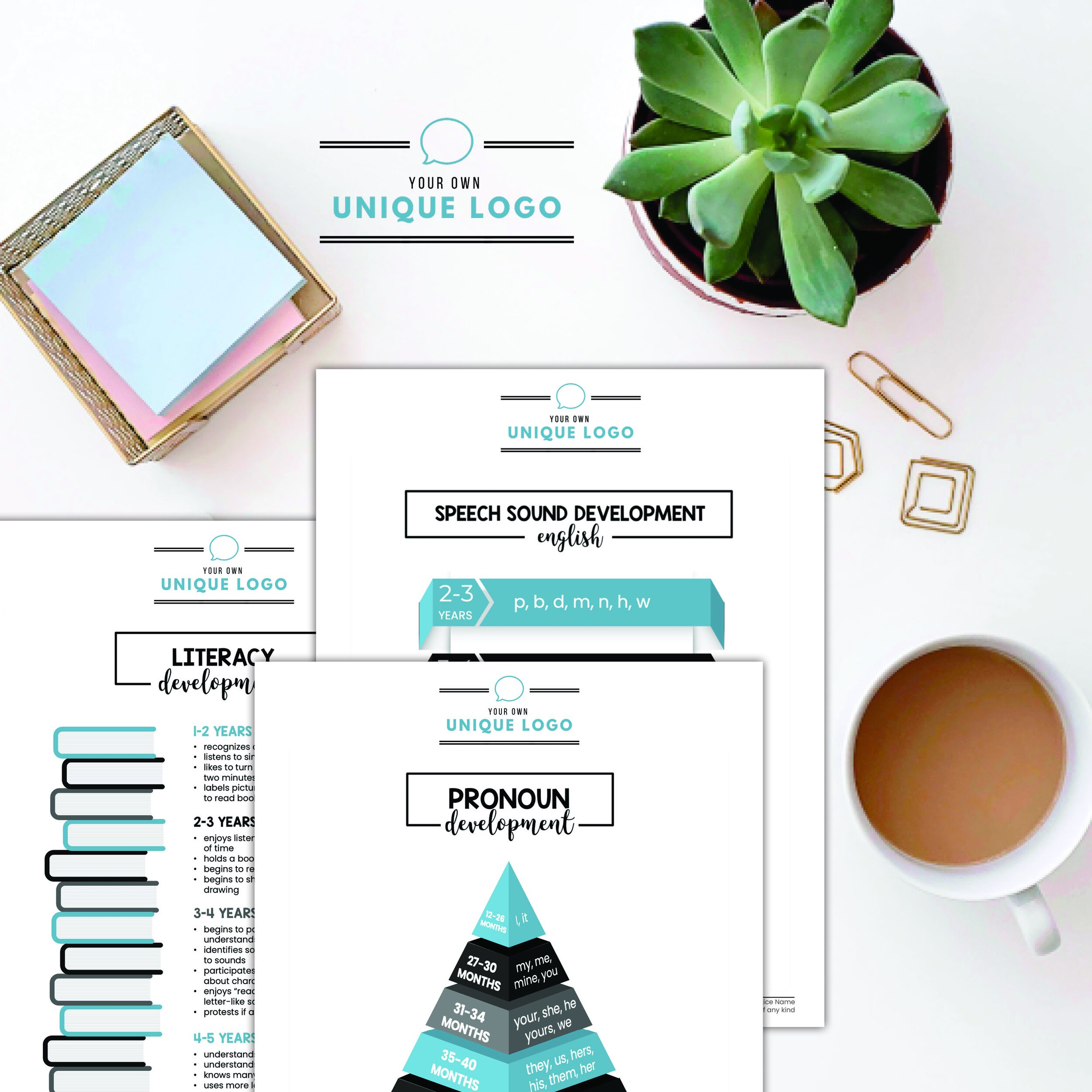
Take this logo, as a fictitious example. This private practice has a simple, minimalist logo, with a brand centering around the blue, grey, and black colors you see in the developmental handouts.
Aside from plastering their logo on signs and forms around their office, this private practice may want to order logo shirts or scrubs. One easy way to stay “on-brand” would be to get these items in brand colors - in this case, blue or perhaps black and grey (hey, options are good!).
But, look at how the original, full-color logo doesn’t show up well on either blue or black.* Without alternative options, your selection of colors is pretty limited.
*Quick note about apparel, in particular. Some companies will be able to take your original, full-color logo and print it in a single color in production. This just depends on the company, and may cost extra, but it is sometimes a possibility.
So, for a (hopefully) minimal upcharge (or none at all), getting these alternative options added to your logo package can save you a lot of headache down the road. As I’ve designed marketing for private practices, I’d had situations where its difficult for clients to use specific photos they’ve provided on their marketing while still featuring their logo prominently. Some images and logos simply don’t play well together. Of course, we always make it work, but wouldn’t you rather have your cake and eat it too?


